Noon Studio: A Bold Brand Identity for a Vibrant Creative Vision
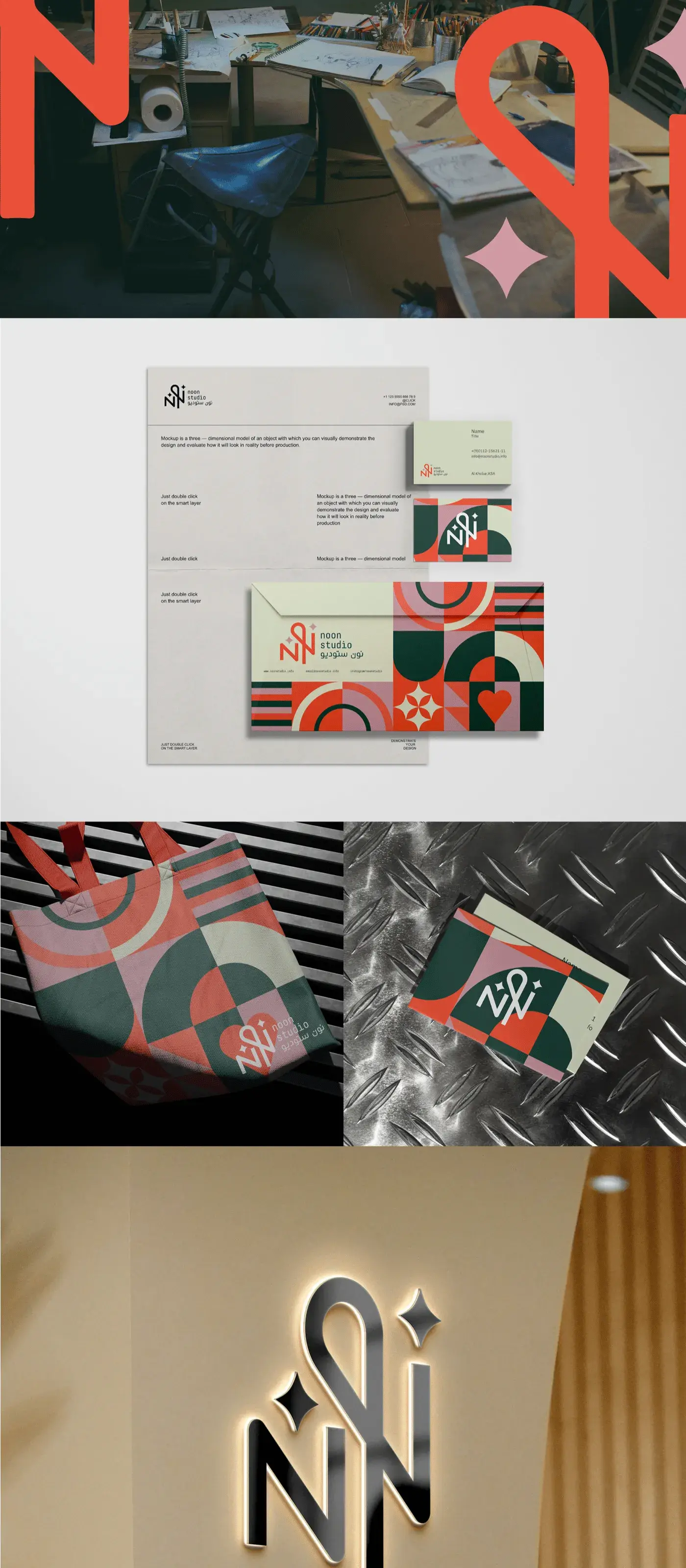
Noon Studio's brand identity reflects a modern, energetic character, combining bold patterns, dynamic shapes, and a harmonious color palette that embodies creativity and innovation. Every element has been carefully designed to express the studio's forward-thinking approach and its commitment to artistic expression.
Project Overview
Noon Studio is a multidisciplinary creative studio based in the Middle East, offering photography, videography, and post-production services to brands across the region. Eclipse Agency was brought on to develop a complete brand identity system that would position Noon Studio as a forward-thinking creative powerhouse capable of competing on an international stage.

The Challenge
Noon Studio had grown rapidly from a small freelance operation into a fully equipped production house, but their visual identity had not kept pace. Their existing logo was a simple wordmark created in the early days, and they lacked any cohesive brand guidelines. As they began pitching to larger clients in fashion, hospitality, and real estate, they found themselves losing out to competitors with more polished presentations.
The team needed an identity that communicated energy, precision, and creative ambition without leaning on cliches commonly found in the production industry. They wanted something that felt alive and dynamic, mirroring the movement and rhythm inherent in their video and photography work.
Additionally, the brand needed to work seamlessly across a wide range of touchpoints, from studio signage and crew apparel to digital portfolios and social media templates. Consistency was paramount, but the system also had to be flexible enough to evolve as the studio expanded its services.
Our Approach
We began with an immersive discovery phase, spending time inside the studio observing their creative process, interviewing the founders, and auditing their competitors. This gave us a deep understanding of what makes Noon Studio unique: their ability to blend cinematic storytelling with commercial efficiency. We distilled this into a brand strategy centered on the concept of "Creative Momentum" — the idea that great work is always in motion.
The visual identity we developed features bold geometric patterns inspired by light and shadow play, a hallmark of their studio work. The primary logo is a modular mark that can be deconstructed into pattern elements, giving the brand a built-in design system. The color palette pairs deep charcoal with vibrant accent tones of electric coral and warm amber, striking the balance between professional and energetic.
We extended the identity into a comprehensive brand toolkit, including presentation templates, social media kits, and environmental graphics for their studio space. Every deliverable was designed to be easy for their internal team to use, ensuring brand consistency would be maintained long after our engagement ended.
Results & Deliverables
Related Projects


Ready to Step Into the Spotlight?
Let's collaborate to build something extraordinary. Tell us about your project and we'll show you what's possible.