Volume: Where Sophistication Meets Style
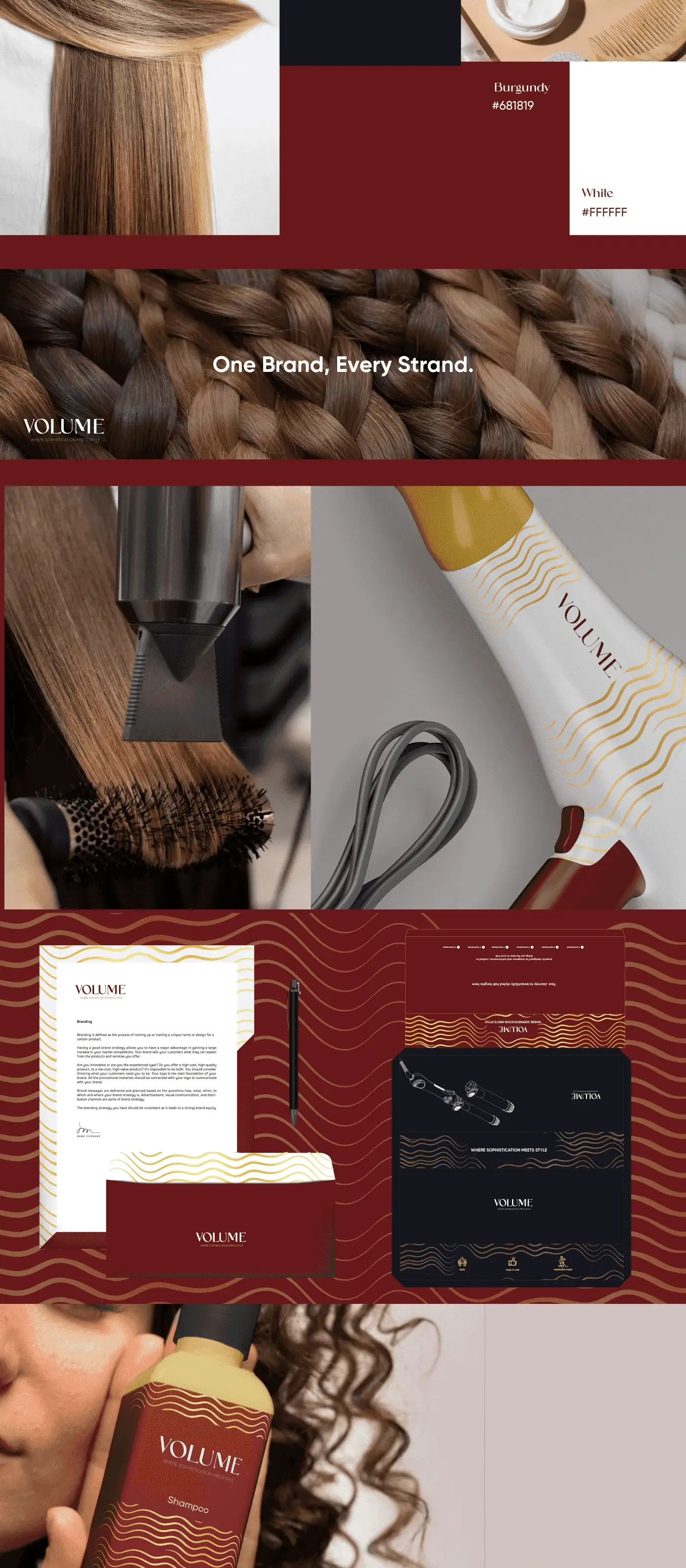
This project highlights our expertise in capturing the essence of a brand and transforming it into an elegant and visually engaging narrative. For Volume, a brand synonymous with refinement and style in haircare, we crafted a brand identity that exudes luxury and modern sophistication.
Project Overview
Volume is a premium haircare brand entering the luxury beauty market with a line of salon-quality products for discerning consumers. Eclipse Agency was engaged to craft a brand identity and packaging system that would position Volume alongside established luxury beauty names from day one.

The Challenge
The luxury haircare market is crowded and fiercely competitive. Established players have decades of brand equity, and consumers in this segment are highly discerning about aesthetics, ingredient quality, and brand story. Volume needed to enter this space with an identity that immediately communicated premium quality without appearing derivative of existing brands.
The founders had a clear vision: they wanted the brand to feel organic and sophisticated, drawing on nature-inspired aesthetics while maintaining a modern, editorial edge. The challenge was avoiding the common trap of luxury beauty branding that leans too heavily on gold foils and ornate details, which can feel dated. Volume needed to feel timeless yet contemporary.
Packaging was particularly critical. The products would launch in boutique salons and high-end retail, where shelf presence is everything. Each bottle, tube, and box needed to tell the brand story at a glance and justify a premium price point through perceived quality alone.
Our Approach
Our strategy centered on what we called "Organic Luxury" — the intersection of natural warmth and refined sophistication. We developed a visual language built around warm, earthy tones (deep amber, soft sand, matte cocoa) that evoke the natural ingredients at the heart of Volume's formulations. These were balanced with cool neutrals and a matte-finish material palette that keeps the brand feeling modern.
The logo combines elegant serif typography with a subtle leaf motif, nodding to the brand's commitment to natural ingredients without being overly literal. We designed the wordmark to feel equally at home on a salon shelf in Dubai as in a lifestyle magazine editorial spread. The supporting visual system uses photography art direction featuring natural textures, soft studio lighting, and carefully composed still-life arrangements.
For packaging, we worked closely with production partners to select materials that reinforced the premium positioning: soft-touch matte bottles, debossed labels, and weighted closures that create a tactile experience of quality. Every detail, from the label stock to the ink finish, was chosen to communicate care and craftsmanship.
Results & Deliverables
From the choice of warm, earthy tones to the interplay of natural textures, every element was meticulously designed to resonate with the brand's promise of elegance and care. The sleek wooden comb paired with luminous capsules emphasizes both the organic and innovative aspects of the brand, ensuring it stands out while remaining authentic. Our goal was to create a visual identity that not only speaks to the target audience but also elevates their perception of Volume as a leader in its industry. This showcase demonstrates how we translate brand values into compelling aesthetics, leaving a lasting impression on consumers.
Related Projects


Ready to Step Into the Spotlight?
Let's collaborate to build something extraordinary. Tell us about your project and we'll show you what's possible.