
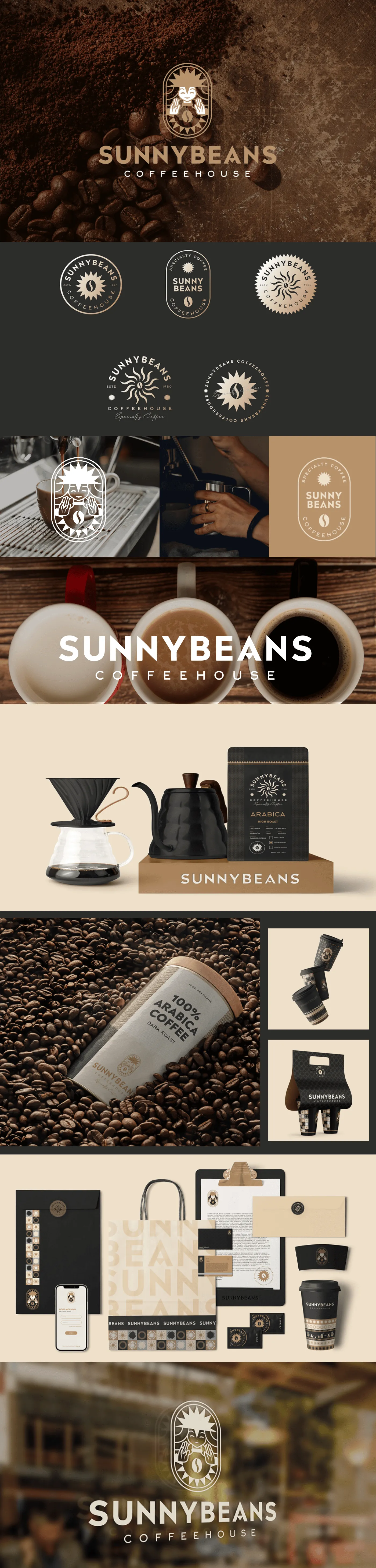
Sunny Beans: Brewing Warmth, Joy, and Community
The branding for Sunny Beans is designed to radiate warmth, joy, and a sense of connection, perfectly encapsulating the spirit of the coffee-loving community it serves. The visual identity revolves around earthy tones that evoke a feeling of groundedness and comfort, paired with playful patterns that reflect the lively and welcoming atmosphere Sunny Beans offers.
Project Overview
Sunny Beans is a growing coffee shop chain focused on building a warm, community-centered brand experience. Eclipse Agency was hired to develop a full brand identity system that would translate the founders' passion for connection and great coffee into a cohesive visual language scalable across multiple locations.
The Challenge
The specialty coffee market has exploded in recent years, and with it, an overwhelming number of coffee brands competing for attention. Sunny Beans needed to stand apart from the sea of minimalist, industrial-chic coffee shops that dominate the market. Their differentiator was clear: they were not just selling coffee, they were building a gathering place where neighbors become friends.
The founders wanted the brand to feel sunny, approachable, and genuinely warm without coming across as childish or unserious about the craft. They had seen too many community-focused brands default to overly cute illustrations or generic coffee iconography. Sunny Beans needed personality and warmth, but it also needed to signal quality and expertise.
With plans to open three new locations in the following year, the brand system also had to be practical: easy for store managers to implement, clear enough for print vendors to execute correctly, and flexible enough to work on everything from a tiny cup stamp to a large storefront sign.
Our Approach
We built the brand around the concept of "Golden Hour" — that warm, inviting moment when sunlight pours through a cafe window and everything feels just right. This concept informed every design decision, from the color palette (warm ambers, soft terracotta, creamy off-white) to the illustration style (hand-drawn, organic, imperfect in a charming way).
The logo features a sun-inspired emblem that doubles as a coffee bean, creating an iconic mark that is instantly recognizable at any scale. We paired it with a rounded, friendly typeface for the wordmark that feels approachable without sacrificing legibility. The supporting pattern system uses playful bean and sunray motifs that can tile across surfaces, creating visual interest on cups, bags, and interior walls.
For the physical experience, we developed a complete interior mood guide with material recommendations, signage specifications, and menu board templates. We also created a social media strategy kit so that each location's baristas could create on-brand content featuring their community, daily specials, and behind-the-scenes moments, all without needing a designer on staff.
Results & Deliverables
At the heart of the brand is a sun-inspired logo, symbolizing optimism, energy, and the bright start that a perfect cup of coffee brings to every day. Every design element has been carefully curated to emphasize a love for coffee, a sense of togetherness, and an inviting charm that resonates with customers. The branding extends to packaging, social media, in-store visuals, and merchandise, each piece carrying the same warmth and vibrancy. Sunny Beans isn't just a coffee brand - it's a celebration of community, good vibes, and shared moments over a delicious brew.
Related Projects



Ready to Step Into the Spotlight?
Let's collaborate to build something extraordinary. Tell us about your project and we'll show you what's possible.