
Forcup: Sophisticated Branding for a Premium Coffee Experience
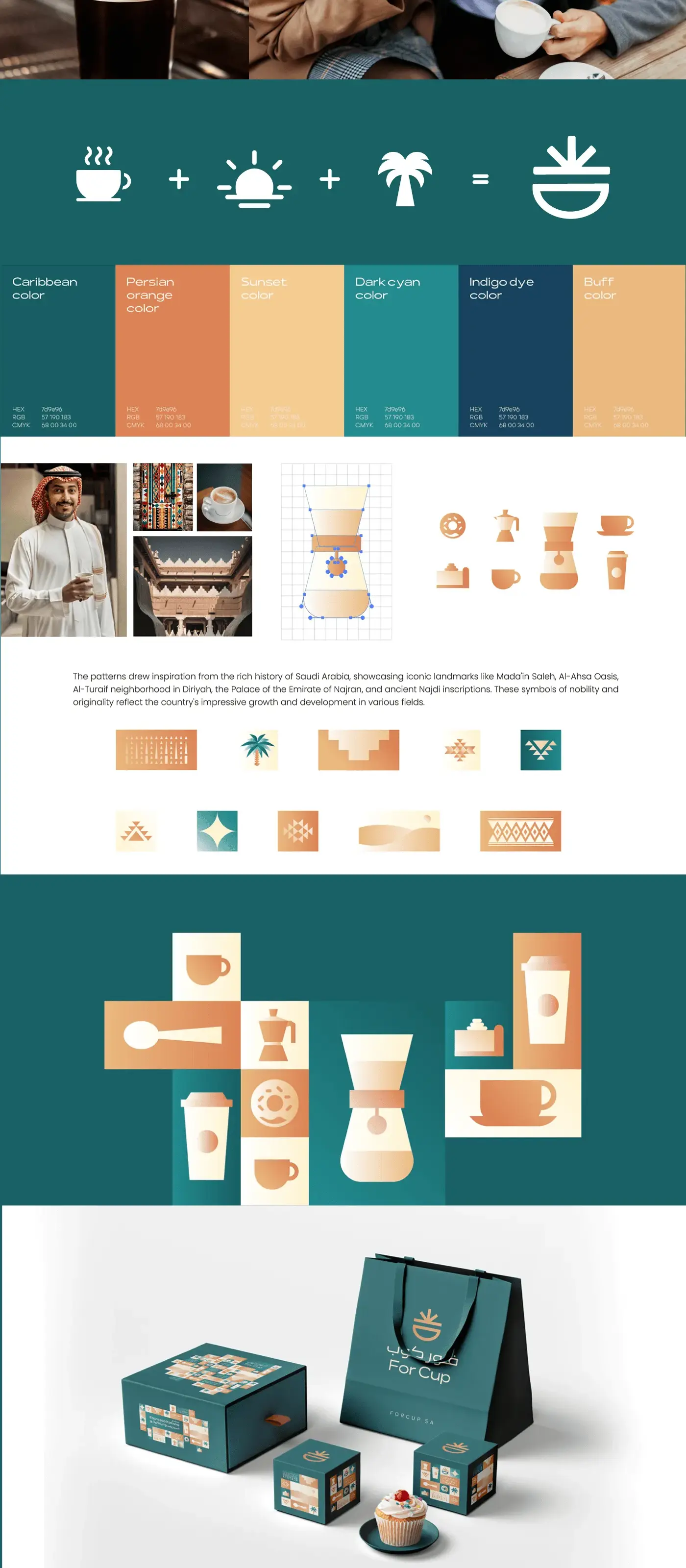
The branding for For Cup blends modern minimalism with a playful edge, featuring clean typography and bold iconography that reflects a fresh and contemporary take on coffee culture. The design emphasizes simplicity and sophistication while maintaining a welcoming and vibrant personality, creating a unique identity that resonates with coffee enthusiasts and modern lifestyles alike.
Project Overview
For Cup is a modern coffee brand targeting a younger, design-conscious audience that sees coffee as part of their lifestyle identity. Eclipse Agency developed a brand system that blends minimalist aesthetics with bold, playful energy to capture a generation that values authenticity and visual appeal in equal measure.

The Challenge
For Cup was founded by a group of young entrepreneurs who noticed a gap in the market: most specialty coffee brands either leaned heavily into third-wave seriousness (with dense tasting notes and barista jargon) or went full mainstream and sacrificed quality perception. They wanted a brand that was genuinely accessible and fun while still being respected by coffee enthusiasts.
The target audience, primarily 18-to-30-year-olds, makes purchasing decisions based on aesthetics and shareability as much as taste. The brand needed to look incredible on Instagram, feel cool to carry around, and work seamlessly in a delivery-first model where the unboxing experience matters as much as the in-store one. At the same time, it could not feel like it was trying too hard, since this demographic has a finely tuned radar for inauthenticity.
The founders also wanted the brand to scale into merchandise and lifestyle products eventually (tote bags, reusable cups, apparel), so the identity needed to be strong enough to stand on its own as a design element, separate from the product itself.
Our Approach
We developed a brand identity rooted in what we called "Clean Boldness" — stripped-back layouts with unexpected pops of personality. The visual system uses a monochromatic base (black, white, and warm grey) punctuated by a single signature accent color, a vibrant coral-orange, that appears selectively across packaging, signage, and digital touchpoints. This restraint makes the brand instantly recognizable while keeping it feeling fresh and uncluttered.
The logo is a bold, geometric wordmark where the "O" in "For" is replaced by a minimal cup icon, creating a clever visual shorthand that works at any scale from a favicon to a storefront. The supporting iconography follows the same geometric language: clean lines, rounded corners, and consistent stroke widths that feel both modern and approachable.
Packaging was designed with shareability as a primary objective. Cup designs feature witty micro-copy and rotating sleeve designs that encourage collecting and photographing. The takeaway bags use a simple fold-and-stamp system that is cost-effective for the brand but feels intentional and craft-oriented to the customer. We also designed a merchandise line including tote bags, enamel pins, and a reusable ceramic cup that became an instant bestseller.
Results & Deliverables
Related Projects



Ready to Step Into the Spotlight?
Let's collaborate to build something extraordinary. Tell us about your project and we'll show you what's possible.