
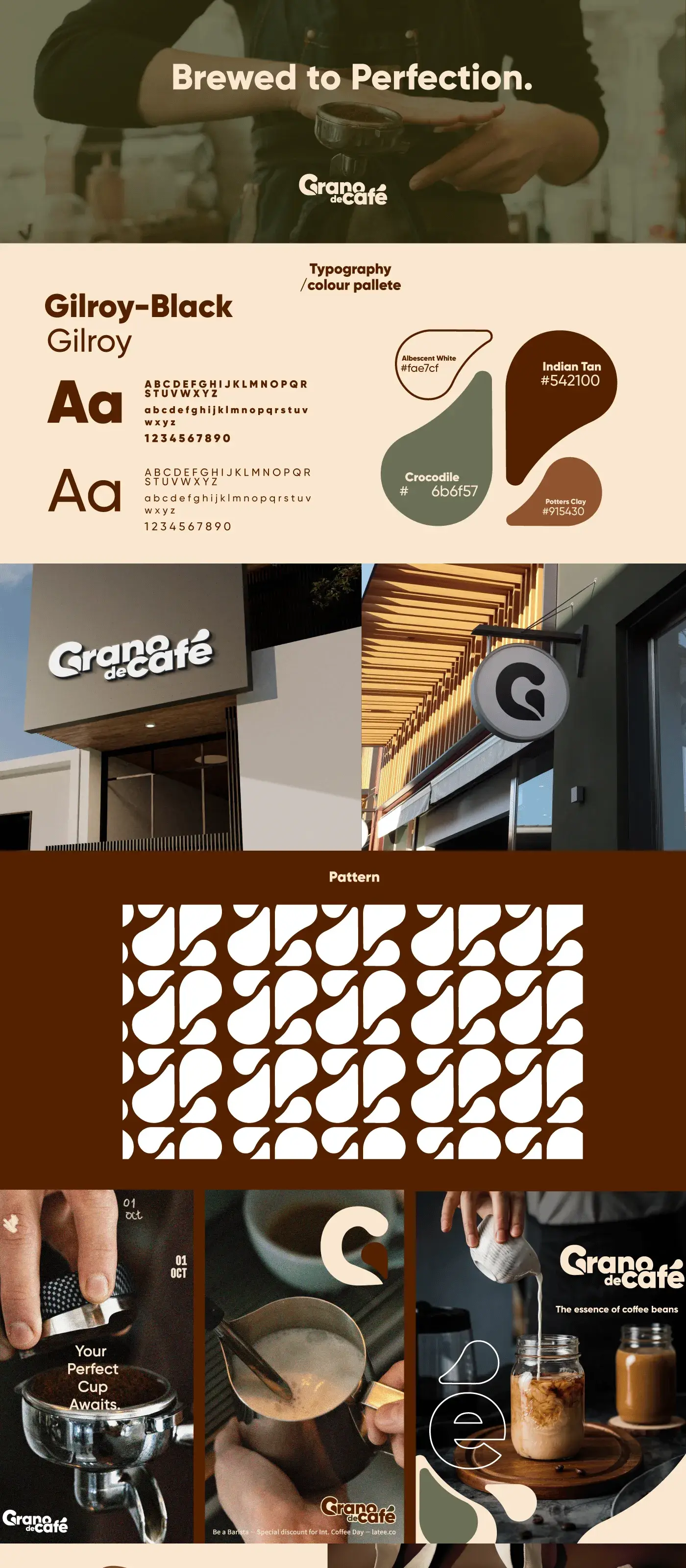
Grano de Café: Authentic Branding for Colombian Coffee Heritage
The branding for Grano de Café captures the authentic essence of Colombian coffee, blending tradition with modern design. A rich, earthy color palette reflects the warmth and depth of coffee culture, while traditional design elements pay homage to the heritage and craftsmanship behind every bean.
Project Overview
Grano de Café is a specialty coffee brand rooted in Colombian coffee heritage, expanding from its home market into premium retail channels across the Middle East. Eclipse Agency was engaged to reimagine their brand identity and packaging to resonate with a new international audience while honoring the rich tradition behind every bean.

The Challenge
Grano de Café had a loyal following in its home market, built on the strength of exceptional single-origin beans and a deep connection to Colombian farming communities. However, their existing branding was heavily localized, using Spanish-language copy, region-specific cultural references, and packaging designed for local grocery shelves. None of it translated well to the international specialty coffee market.
The brand needed to expand into Gulf markets, where consumers are sophisticated coffee drinkers willing to pay a premium for quality and provenance. The challenge was to modernize the brand for an international audience without stripping away the authenticity and heritage story that made Grano de Café special in the first place. Too modern, and it would feel generic; too traditional, and it would feel out of place on a premium shelf in Riyadh or Dubai.
Packaging complexity added another layer. The product line included whole-bean bags, ground coffee pouches, single-serve capsules, and a cold-brew ready-to-drink bottle. Each format had different structural constraints and retail environments, yet all needed to feel unmistakably part of the same family.
Our Approach
We developed a brand positioning around the concept of "Heritage Refined" — celebrating the raw, honest story of Colombian coffee farming through a lens of modern design sophistication. This allowed us to keep the narrative of origin, craftsmanship, and community at the core while wrapping it in a visual language that speaks to international premium consumers.
The color palette draws directly from the Colombian coffee landscape: deep soil browns, ripe cherry reds, lush canopy greens, and warm parchment tones. We paired these earthy tones with contemporary typography and clean layout principles to create a look that is warm and authentic but never rustic. The logo features a stylized coffee cherry branch rendered in a single continuous line, symbolizing the unbroken connection between farm and cup.
For packaging, we created a flexible system where each product format shares core brand elements (logo placement, color coding by roast level, origin story panel) but adapts its layout to the specific format. The whole-bean bags use kraft paper with a generous window to showcase the beans, while the capsule boxes feature bold color blocking for easy shelf navigation. Every package includes a QR code linking to the specific farm and harvest story behind that batch.
Results & Deliverables
Each aspect of the branding emphasizes quality and authenticity, celebrating the story of Colombian coffee through a cohesive visual identity. From packaging to promotional materials, the designs create an inviting and memorable experience, evoking the richness of flavor and the connection to coffee's origins that Grano de Café represents.
Related Projects



Ready to Step Into the Spotlight?
Let's collaborate to build something extraordinary. Tell us about your project and we'll show you what's possible.