
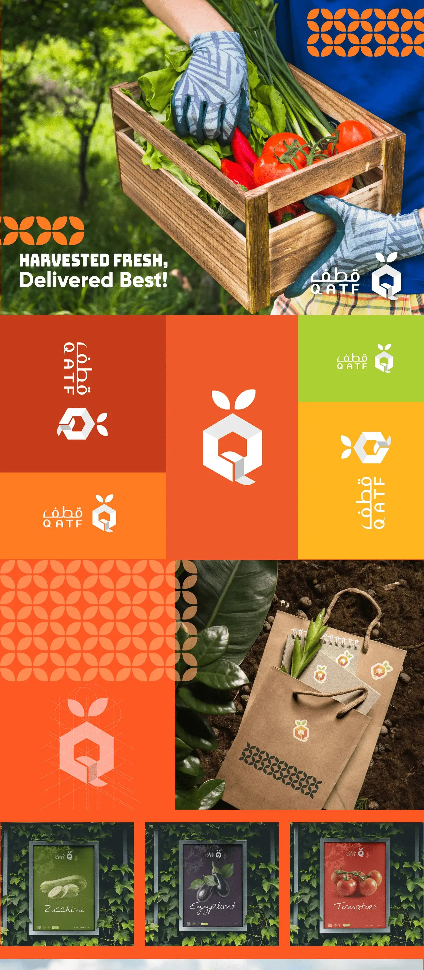
Qatf: Fresh Branding for Premium Agricultural Products
The branding for Qatf embodies a fresh and modern identity, highlighting the premium quality of its agricultural products. With clean visuals and an organic aesthetic, the design emphasizes the brand's commitment to sustainability and natural excellence.
Project Overview
Qatf (Arabic for "harvest") is an agricultural products company transitioning from a wholesale supplier into a premium consumer-facing brand. Eclipse Agency was brought in to develop a sophisticated brand identity and packaging system that would elevate their products from commodity goods to premium shelf staples in upscale grocery and specialty food retail.

The Challenge
For years, Qatf had operated behind the scenes, supplying dates, honey, olive oil, and dried herbs to distributors and food manufacturers. Their products were exceptional, sourced from carefully selected farms across Saudi Arabia and the Levant, but they had zero consumer brand recognition. Their packaging was purely functional: plain labels with regulatory information and nothing more.
The shift to direct-to-consumer retail meant competing against established premium food brands with significant marketing budgets and strong shelf presence. Qatf needed a brand that could instantly communicate quality, provenance, and the natural purity of their products. The branding had to work across a diverse product line, from golden Sukkari dates to mountain-sourced wild honey, each with its own story and character.
There was also a cultural dimension. Qatf wanted to celebrate the agricultural heritage of the region, positioning Saudi and Levantine farming traditions as worthy of the same premium treatment that European products like Italian olive oil or French honey receive. The brand needed to convey pride in regional origins without feeling parochial.
Our Approach
We anchored the brand strategy in the concept of "Nature, Elevated" — taking the raw beauty of the land and presenting it with the refinement it deserves. The visual identity draws heavily on organic forms: leaf silhouettes, grain textures, and topographic contour lines that reference the diverse landscapes where Qatf sources its products. These elements are rendered in a clean, contemporary style that feels premium rather than rustic.
The color palette is structured around a system where each product category has its own earthy tone (warm amber for honey, deep olive for oil, rich burgundy for dates) unified by a shared cream background and dark forest-green typography. This creates a cohesive family look on shelf while allowing each product to maintain its own identity. The logo features the Arabic word "Qatf" in a custom calligraphic style with a stylized leaf emerging from the final letter.
Packaging was designed to feel like a gift, even in everyday purchases. Glass jars replaced plastic containers, labels feature subtle embossing, and each product includes a folded origin card telling the story of the specific farm and region. For the premium gift line, we designed wooden crate sets with a magnetic closure and custom tissue paper, targeting the Saudi gifting market during Ramadan and national holidays.
Results & Deliverables
The logo and color palette reflect the essence of fresh produce, while the minimalistic layouts create a sense of elegance and trustworthiness. Qatf's branding is tailored to appeal to consumers who value quality, health, and eco-friendly practices, ensuring a strong and lasting connection with its audience.
Related Projects



Ready to Step Into the Spotlight?
Let's collaborate to build something extraordinary. Tell us about your project and we'll show you what's possible.